Inspiration Boards
12 Stunning Color Palettes for a Spring Wedding
I feel, with Summer already just around the corner, that I’m a little late with this year’s look at Spring color palettes. But better late than never! I’ve always thought Fall was the prettiest season for color, and yet whenever I look at the soft hues of Spring I find myself envying those of you choosing this season for your wedding celebration. Of course the hardest part is choosing a favourite …..
Chartreuse, Blush & Jade
I love this combination (so much so that you will find one similar in these Fall color palettes) it’s so fresh but with a hint of age that gives it an unmistakably old world feel. And it is one of those versatile palettes that will look beautiful in any setting or venue……
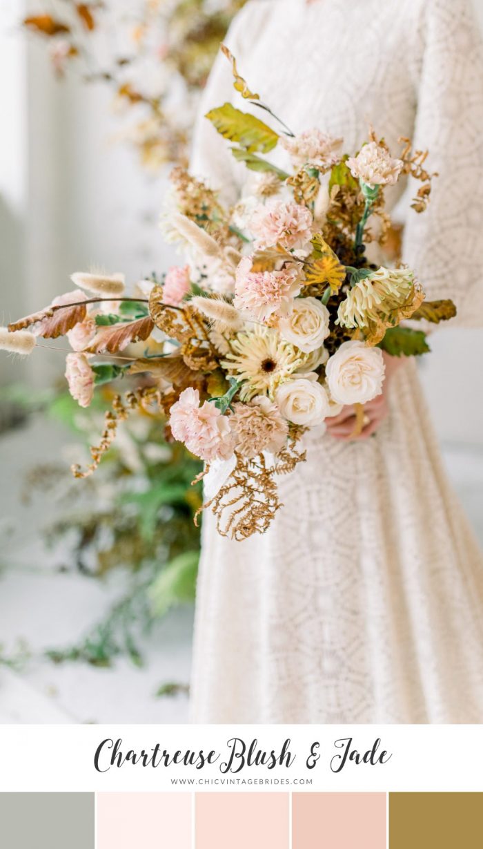
Bouquet Jarabina || Photography – Janca Photography via Once Wed
Shades of Purple
Plums and deeper jewel tones are most often associated with Fall, but mixed with dusky purples and lavender it is a palette that will look just as lovely in Spring.
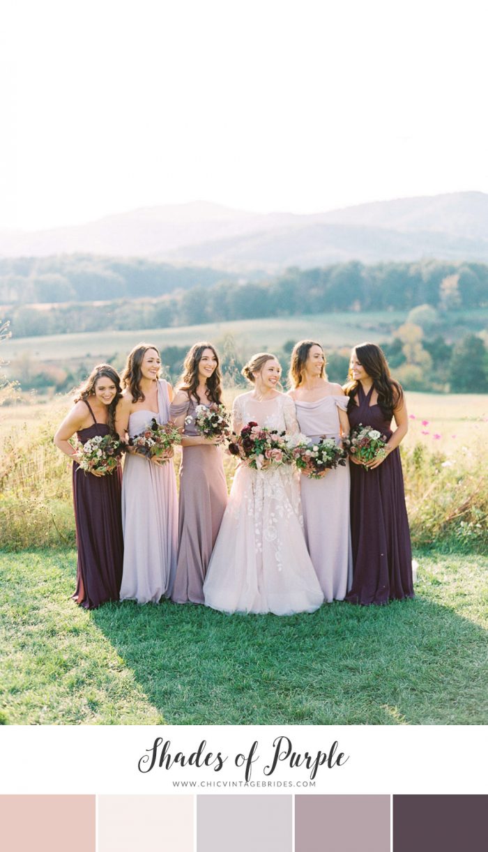
Ashley Relvas via Style Me Pretty
Peony Perfection
Peonies are my absolute favourite flower, coming in the prettiest shades of pink and only blooming in Spring, they make the perfect inspiration for a palette – and a really good reason for choosing this season (if you need another one!)
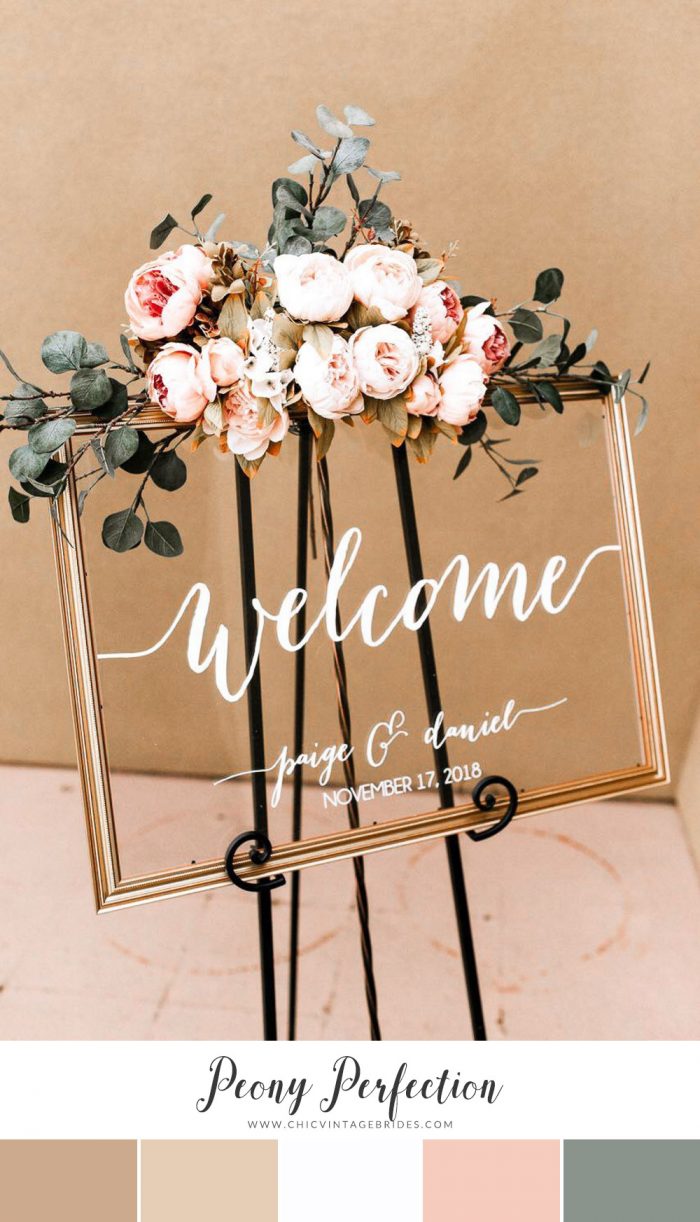
Acrylic Wedding Sign – Paper & Pine Co
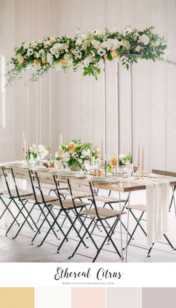
Ethereal Citrus
A contemporary palette for a Spring wedding, I love the contrast of warm yellow with soft silver and grey. And with a hint of blush it is also surprisingly romantic. It would work so well in a white space – perhaps a loft or a renovated barn. Just be sure to include lots of greenery.
Navy & Stone
This more masculine mix of colors may not be the most obvious choice for a Spring wedding, but it is one that works surprisingly well. It would be the perfect palette for a garden wedding at a country estate or historical venue, where your groom can channel his inner Lord Grantham with some tweed…..
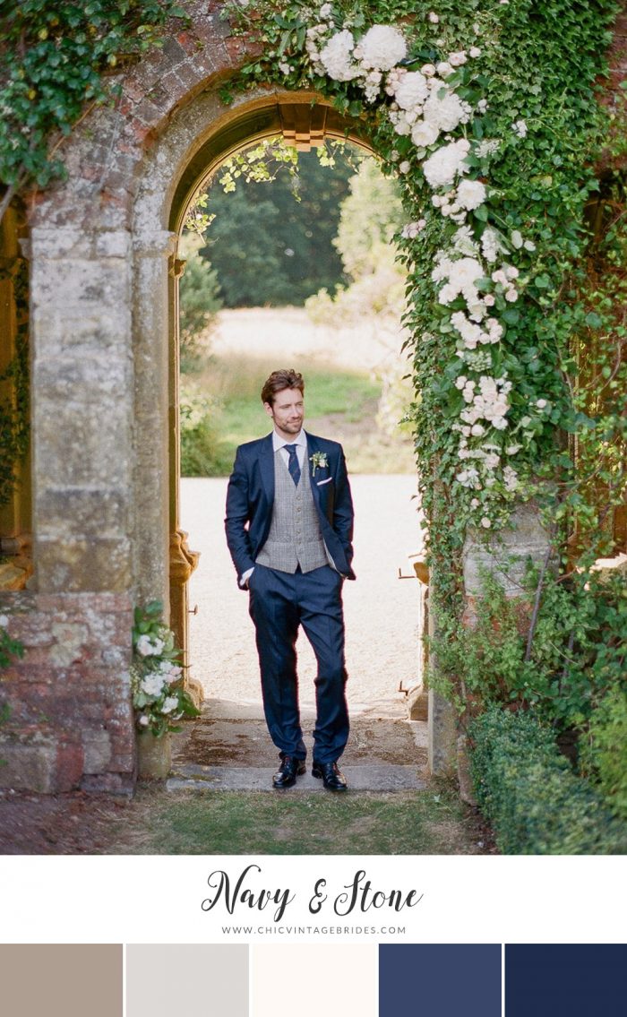
Julie Michaelsen Photography via Chic Vintage Brides
Silver & Blush
You can’t get a more feminine color palette than this mix of soft shades of blush and silver. As well as being super romantic it is also one of the most versatile color palettes, looking lovely whatever your chosen setting or venue….. plus of course it is perfect for creating that lovely mismatched look for your bridesmaids!
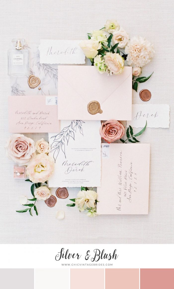
Invitation Suite – Lo Zukowski || Photography – iamlatreuo photo via Chic Vintage Brides
Forget-Me-Not
From feminine hues to duskier blues…. This wedding color palette is understated and not overly feminine, yet would still look timelessly romantic. The key to it not looking too Wintery is to use plenty of seasonal blooms and add splashes of gold to your decor for warmth.
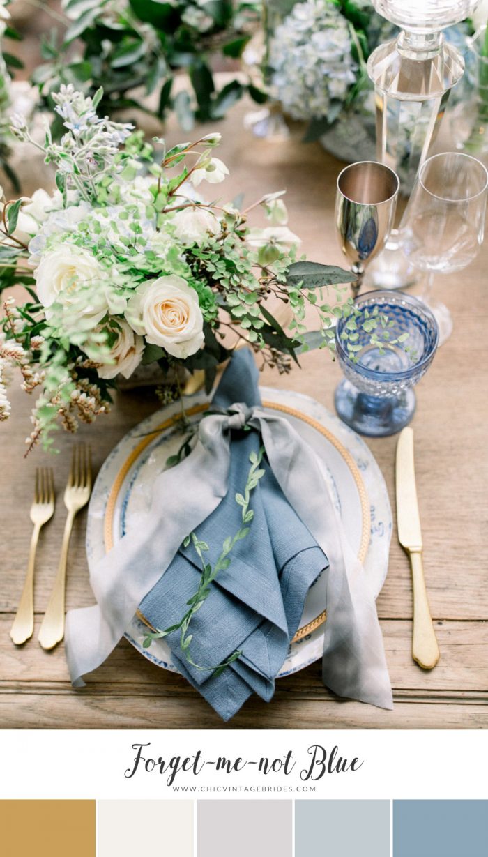
Brett Hickman Photography via Style Me Pretty
Coral Ombre
Coral is THE color is for 2019 according to Pantone so expect to see it everywhere, and I for one am fully embracing it with a palette that mixes shades of this pretty color with rich gold…..
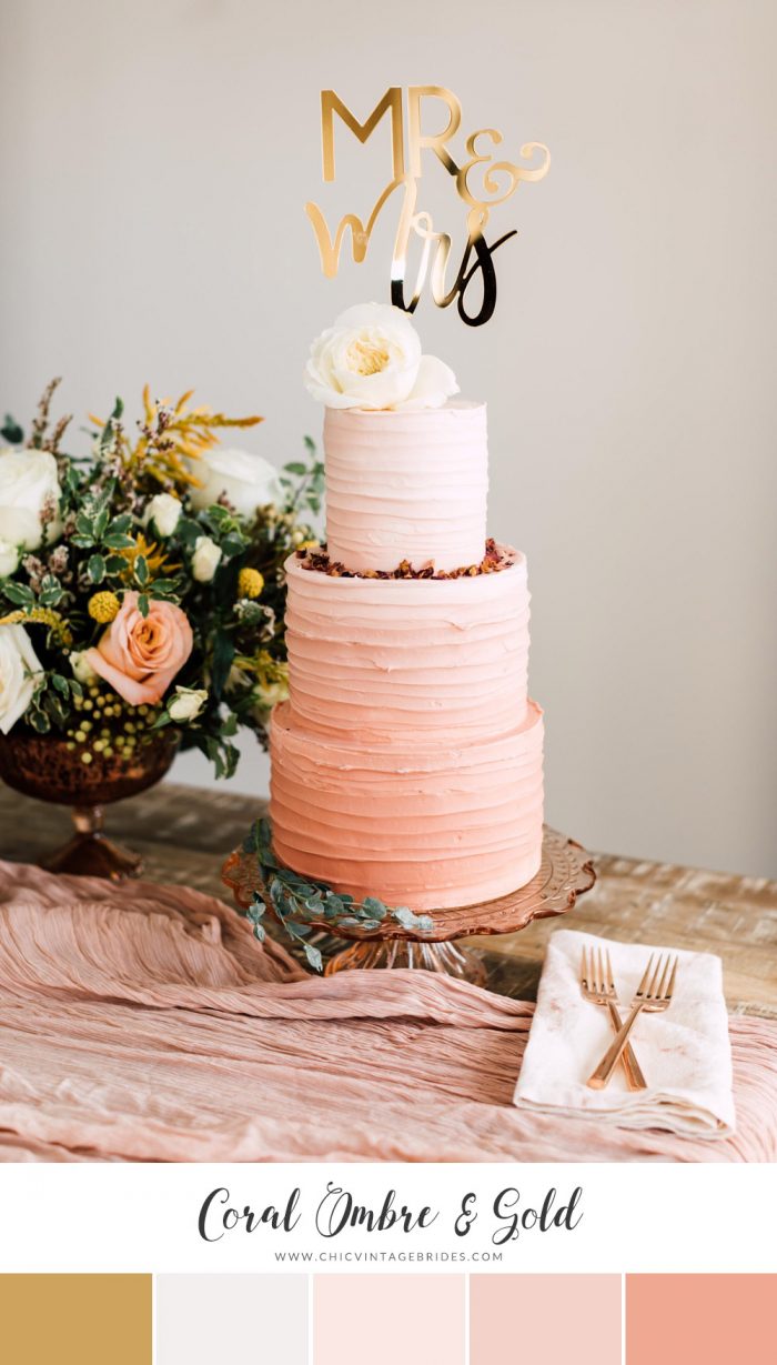
Wedding Cake & Topper – Happily Ever Etched Inc
Misty Yellow & Green
This colour palette is the perfect mix of early Spring hues and romance. With a lingering Wintry dusk, these soft shades of yellow and green somehow manage to be contemporary with a minimalist feel, yet still hint at an old world romance..…
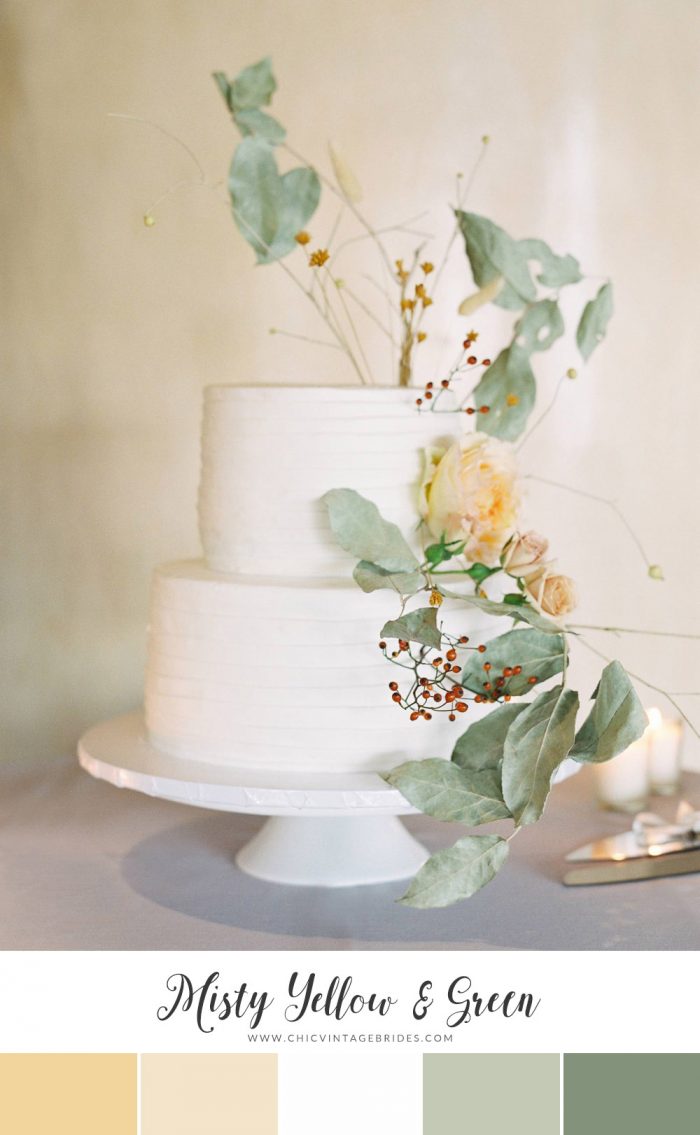
Kings Hawaiin || Photography – Sara Weir Photography via Magnolia Rouge
Silver & Emerald
Greenery is a trend that isn’t going anywhere! And this color palette embraces it alongside the minimalist look that Meghan & Harry’s chic wedding has made so popular…. nothing says understated elegance like a monochromatic color palette!
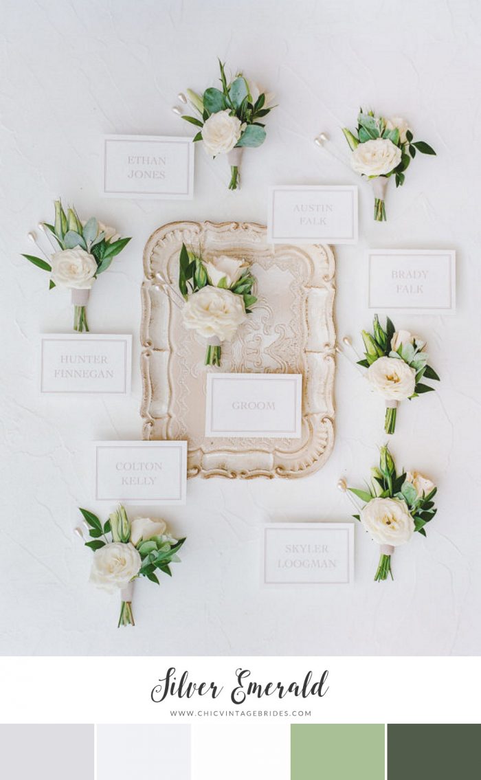
Unique Floral Designs || Photography – Rebecca Yale Photography via Style Me Pretty
Greyed Pastels
An unusual alternative to the more traditional Spring pastels! The blend of ethereal shades of grey with dusky pink and yellow though is perfectly pretty and hints at a golden age. I love the addition of lace and greenery to this look and can just imagine it for an historic church or country estate setting…
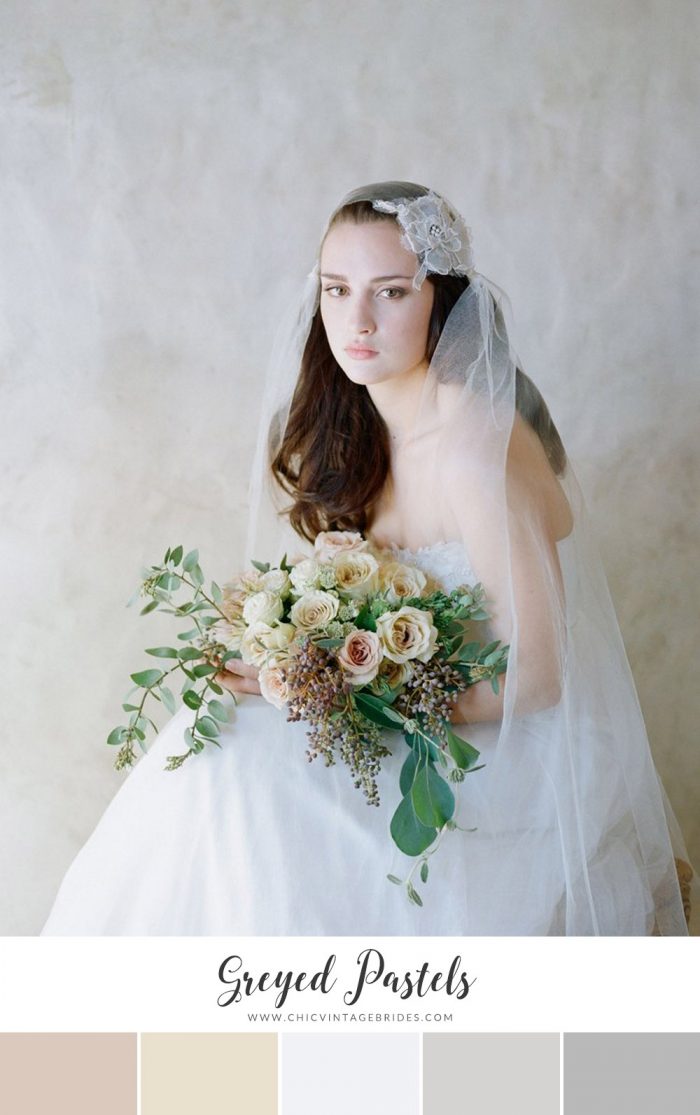
Floral Juliet Cap Veil – Twigs & Honey || Photography – Elizabeth Messina
Spring Blooms
This palette just couldn’t be any prettier! The crisp powder blue is delicate and surprisingly feminine (with stock and blue thistle coming in the perfect shades), whilst the soft shades of peach adds contrast and warmth. And it is one of those palettes that will be loved as much by the men as the ladies in your wedding party…..
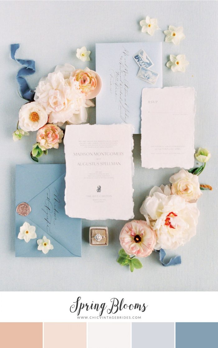
Invitation – Olive Saint Lily || Photography – Anya Kernes via Style Me
Pretty
I love them all…. there’s just something about the soft shades of Spring that make them so romantic. It really is the prettiest season to get married!
If you’re head over heels with these soft and pretty shades, and you would like to see more Spring wedding colours and inspiration boards you might like to see this ethereal beauty with a hint of yellow, or this elegant inspiration board in soft greys and green and this black tie garden affair! Or for something a little more feminine, this romance-fest in rose quartz and serenity blue.
Or if you haven’t decided on a season yet you might want to peruse some of my favourite palettes for Fall, Winter & Summer.
Amy
x

