Inspiration Boards
10 Beautiful Wedding Colours for Fall from Pantone – Part I
This one is a little late (or a lot late even, considering they will be unveiling their Spring 2018 colours in little over a month) but with the end of Summer just around the corner I thought there was no better time than now to share Pantone’s color picks for Fall 2017! Whilst this might come too late for brides planning a wedding this year, these colors really are so beautifully timeless that they will make just as perfect a choice for a Fall wedding next year!
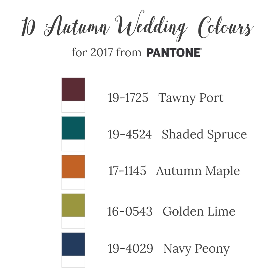
This is the third year I’ve covered Pantone’s colors, but in case you might be new to Chic Vintage Brides and are sat looking at the screen wondering who is Pantone? And why are the colors they choose so important? Let me give you the lowdown.
The Pantone Color Institute are pretty much the world authority on colour. Their colour cards and codes (those 6 digit numbers that precede each shade’s name) are referenced and used by almost every industry on the planet, and especially the fashion and wedding industries! And when they say a colour is fabulous and going to be big next year, they’re usually right.
Remember last year the world was awash with pastel blue and pink? That’s because Pantone chose Serenity & Rose Quartz as their colors of the year. And have you noticed how this year greenery is everywhere? Well, guess what color Pantone picked for 2017? Yep, that’s right, Greenery!
Every season the team at Pantone evaluates the colors shown by designers in their collections at New York Fashion Week. This information is then used to create a list of their top 10 colors for the upcoming season. And almost without fail, theses the hues and shades that fill the shops!
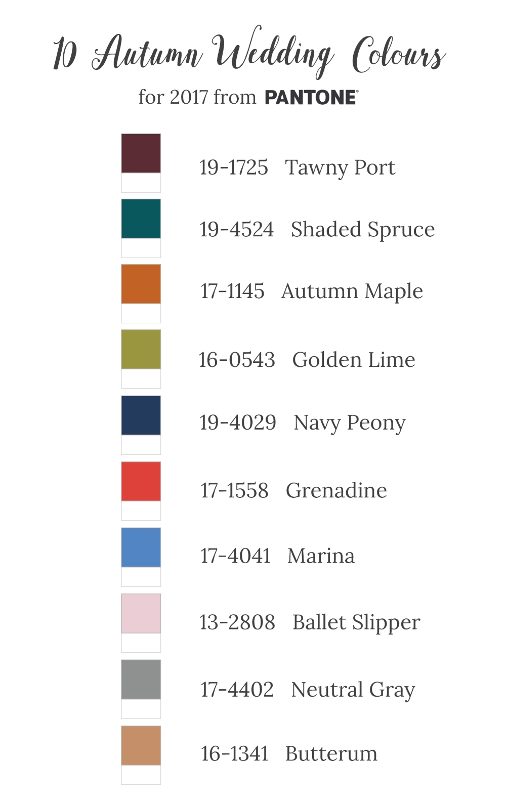
So, what did they have to say for Fall 2017? Leatrice Eiseman, Executive Director of the Pantone Color Institute, shared “Bookended by a dynamic Grenadine red and a tawny Autumn Maple, the color palette for Fall 2017 leans more to warmth. While comforting, enveloping colors and ease are crucial to the seasonal feeling, standout shades include a pale pink Ballet Slipper, a refreshing Golden Lime, and a bright Marina blue. These hues add a striking touch when paired with the classic autumnal shades of Navy Peony, Neutral Gray, Butterrum and Tawny Port.”
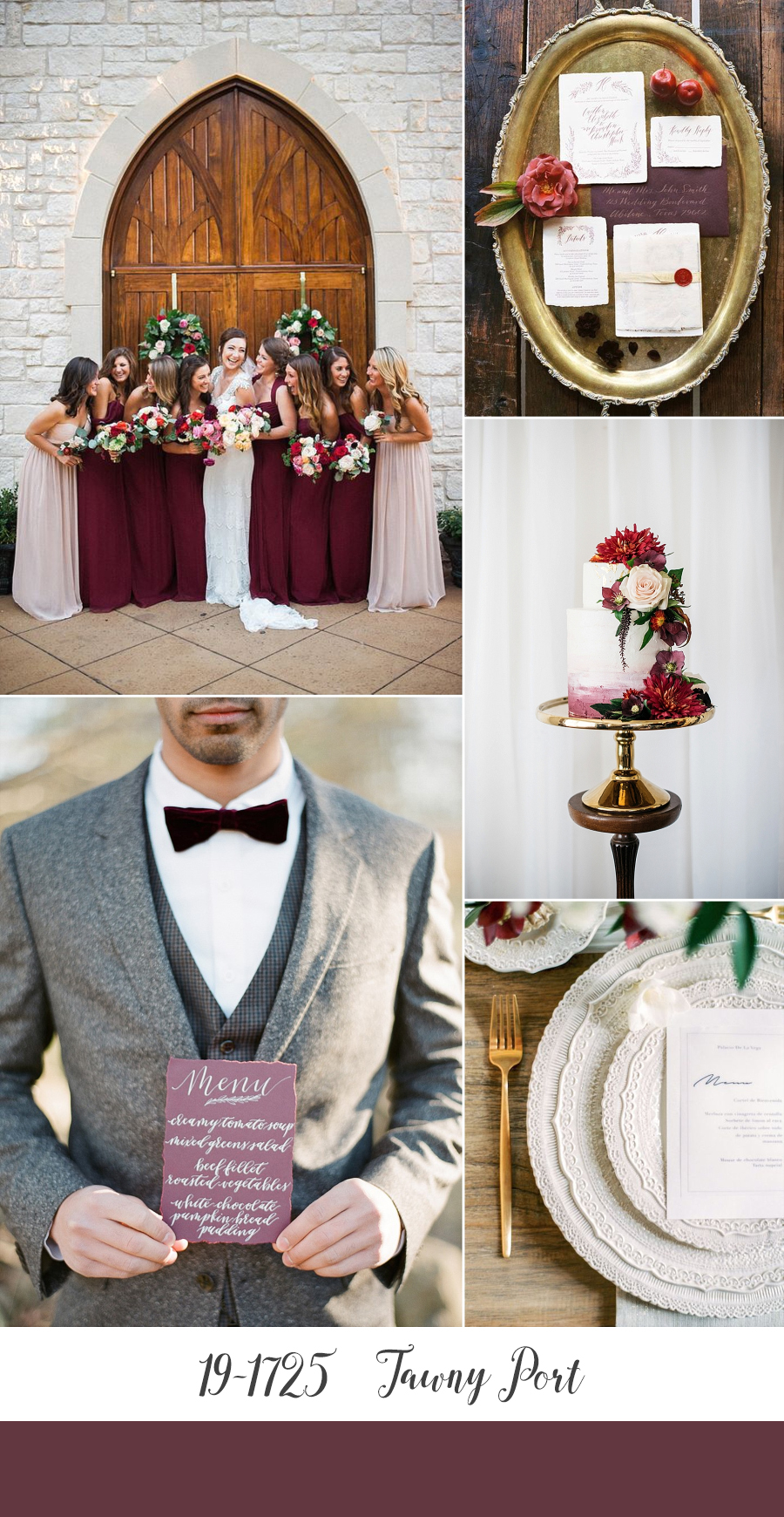
Tawny Port
Hot on the heels of the success of Marsala in 2016, this year Pantone have taken red to a new depth. Tawny Port is not only dramatic, it is elegant, sophisticated, and absolutely perfect for a romantic modern-vintage wedding!
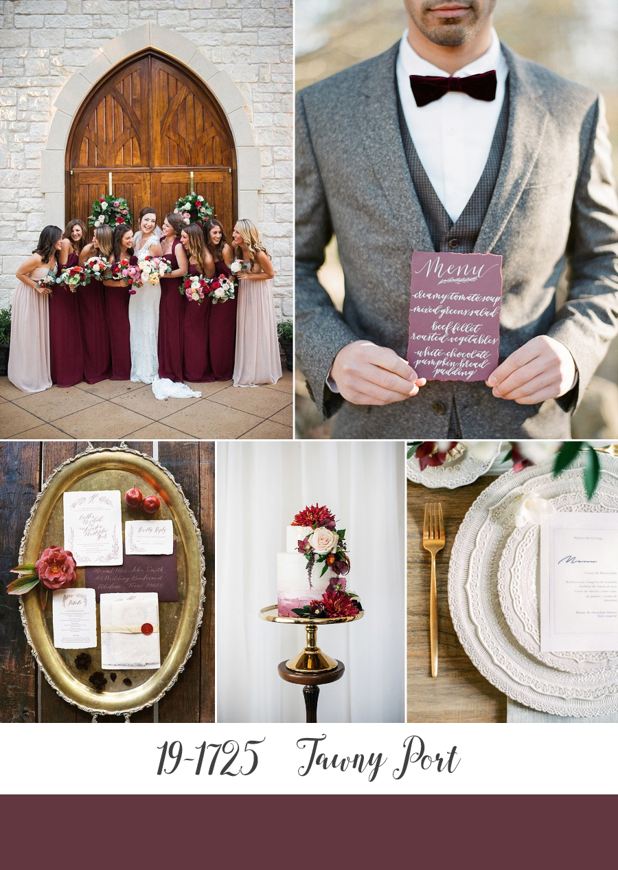
Bridesmaids – Tracy Enoch Photography via Elizabeth Anne Designs // Groom + Menu – Heather Roth Fine Art Photography via Chic Vintage Brides // Stationery – The Nouveau Romantics, Photography by Taylor Lord via Green Wedding Shoes // Wedding Cake – The Pretty Little Details Co., Photography by Meredith Lord via Paper + Lace // Place Setting – Mila Diluart Events, Photography by Arturo Diluart via Burnetts Boards
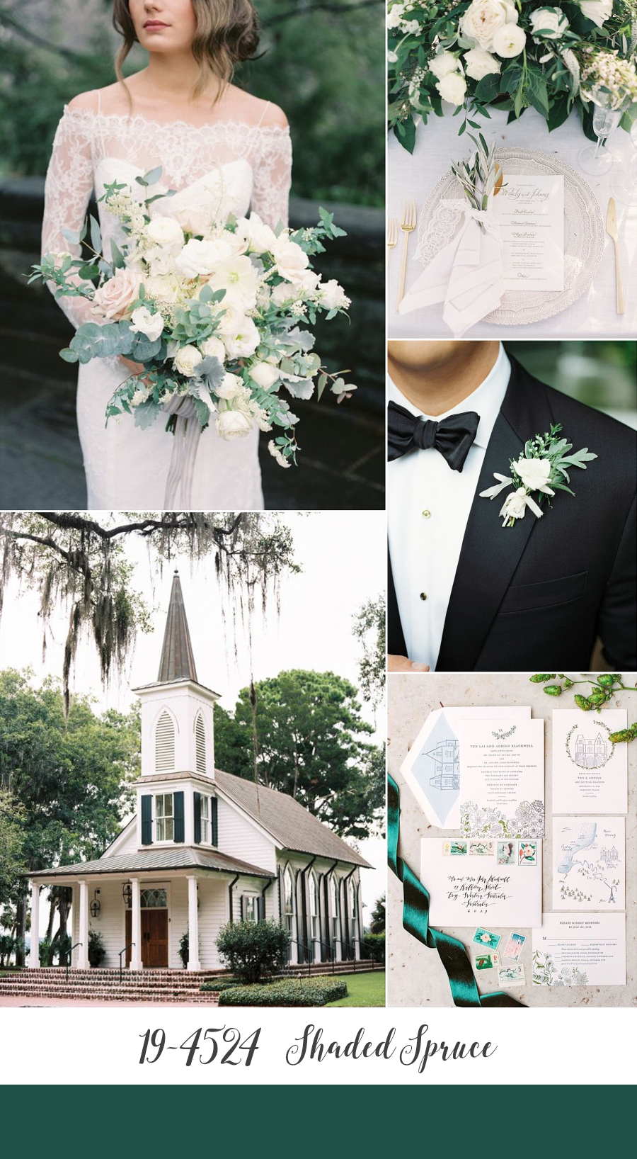
Shaded Spruce
Continuing their love of green in 2017, Pantone went with a rich jewel tone for Autumn. If you’re loving the greenery trend right now, then this is the color for you!
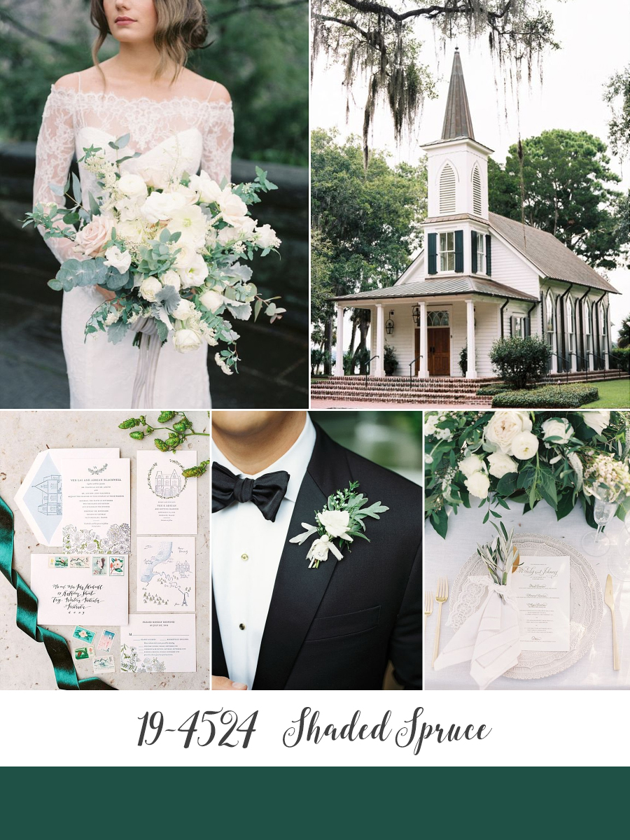
Bride & Bouquet – Designs By Ahn, Photography by Stephanie Sunderland via Elizabeth Anne Designs on Aisle Society // Church – Perry Vaile via SMP // Stationery Suite – Sesame Letterpress, Photography by 2 Brides Photography via SMP // Groom – Marcie Meredith Photography via SMP // Place Setting – Caroline Tran via SMP
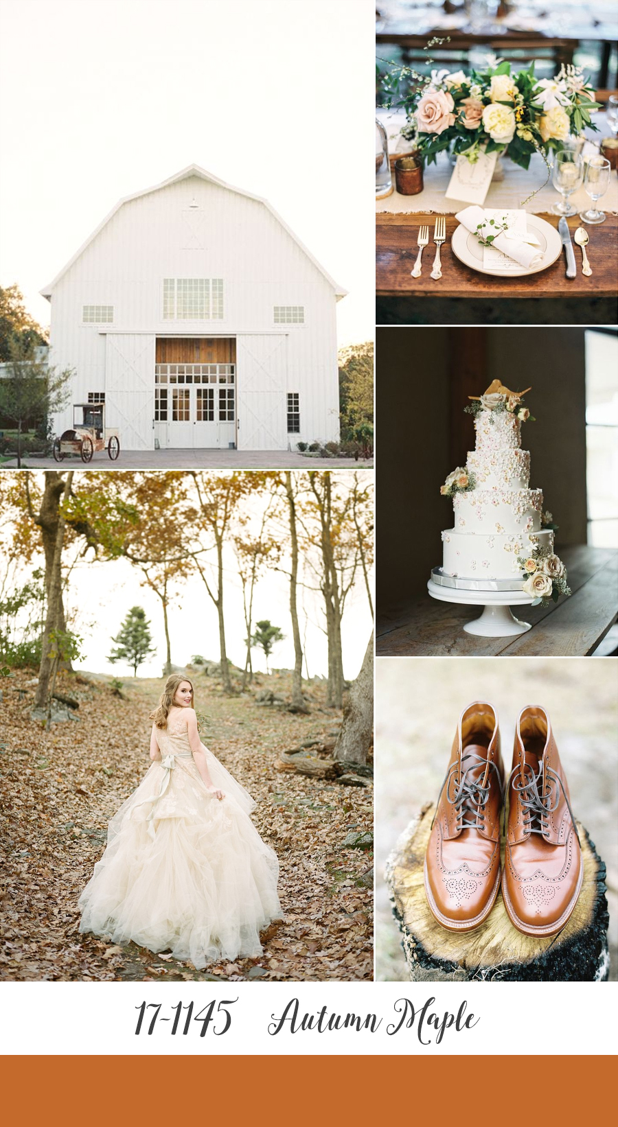
Autumn Maple
A quintessential Fall colour, Autumn Maple is a tawny, russet brown that introduces warmth into the palette. If brown isn’t for you though, you can incorporate this colour into your celebration, and add another layer of luxury at the same time, with touches of copper!
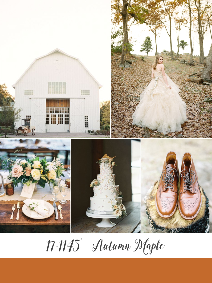
Barn – Taylor Lord Photography via Hey Wedding Lady // Bride – Koby Brown via Chic Vintage Brides // Place Setting – Taylor Lord Photography via Wedding Sparrow // Wedding Cake – Magpies Bakery, Photography by Clark Brewer Photography via Grey Likes Weddings // Groom’s Shoes – Ryan Ray Photography via SMP
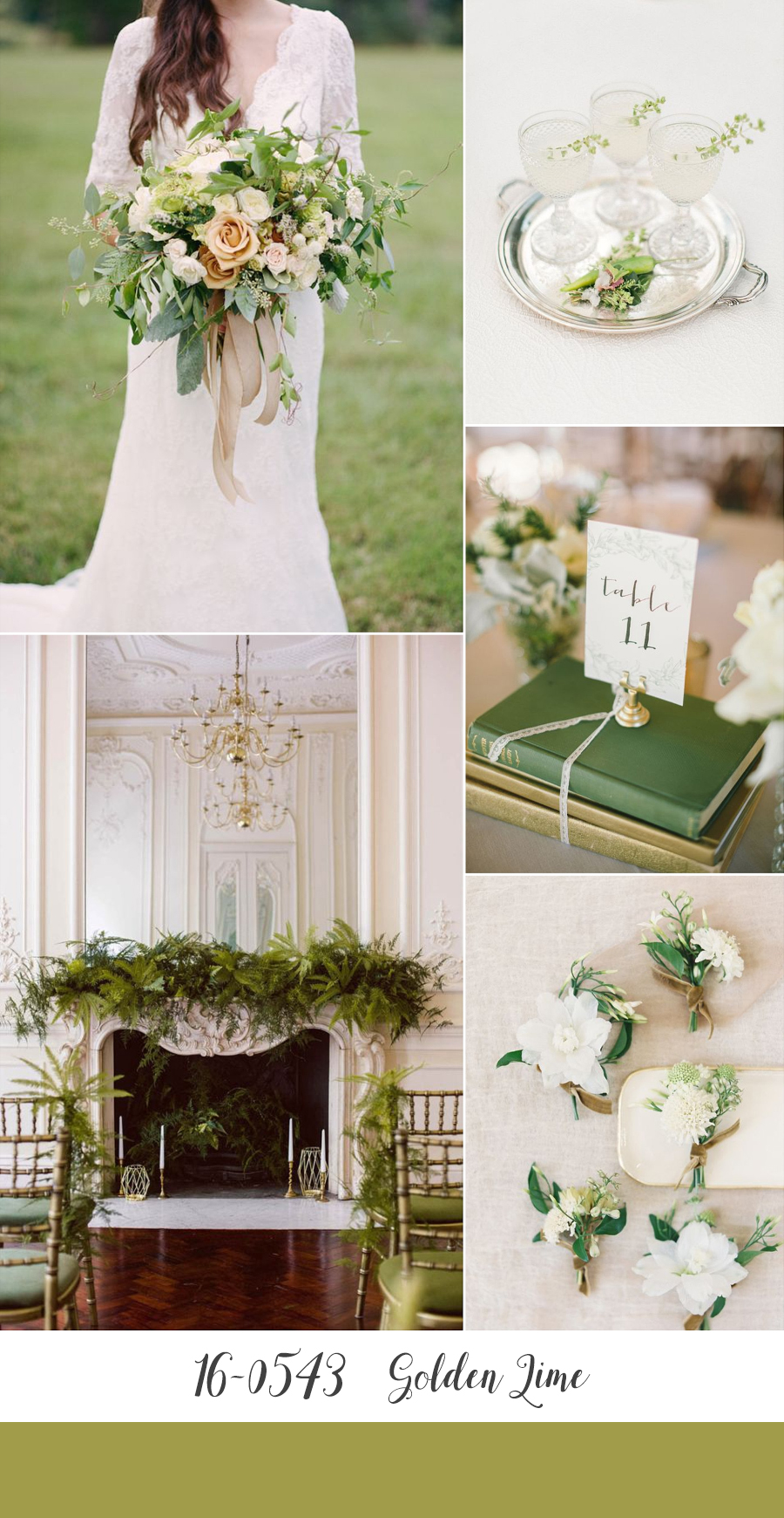
Golden Lime
A move on from their Spring 2017 ‘Greenery’, the golden undertones of Golden Lime makes this yellow-green shade an earthy tone choice with a twist, and a refreshing complement to the other fall classics. With a hint of chartreuse it is also has an unmistakably olde world feel – can’t you just imagine a luxurious velvet in this gorgeous shade??
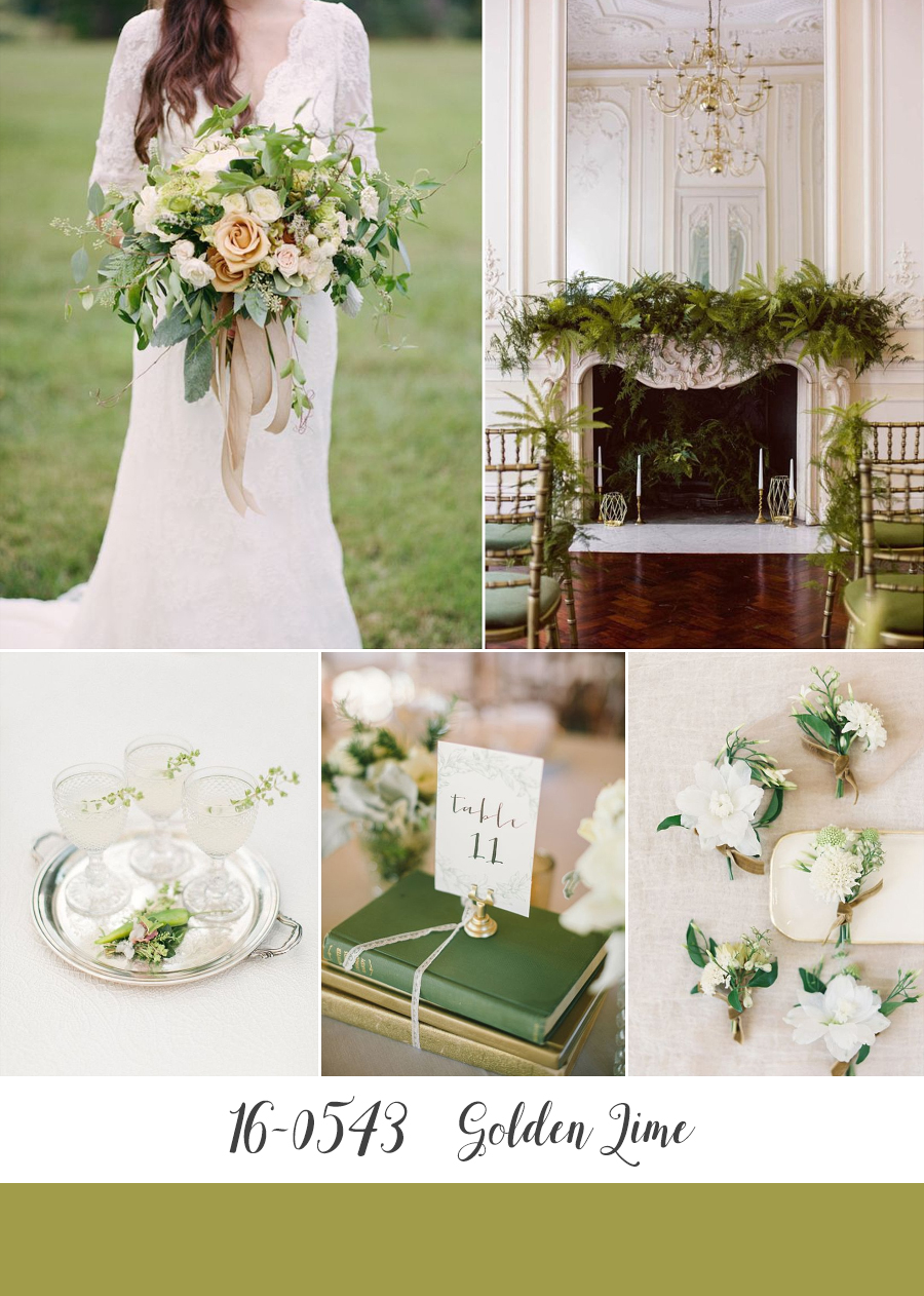
Bride & Bouquet – Tourterelle Floral, Photography by Kacie Lynch via Burnetts Boards // Wedding Venue – Helen Abraham Photography via Want That Wedding // Cocktails – Rachel May via Wedding Sparrow // Table Centerpiece – Delbarr Moradi via SMP // Boutonnieres – Bows and Arrows, Photography by Kayla Barker via Chic Vintage Brides
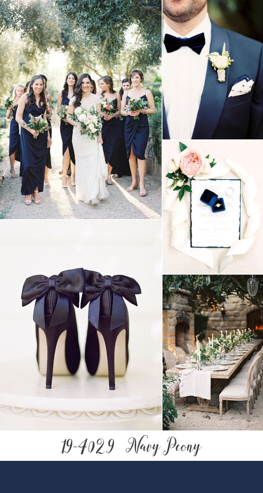
Navy Peony
Continuing with the jewel tones, Navy Peony is a romantic, dark sapphire blue that will add a timeless sense of opulence to any wedding. This deep hue also gives grooms and groomsmen a stylish alternative to the traditional black tux!
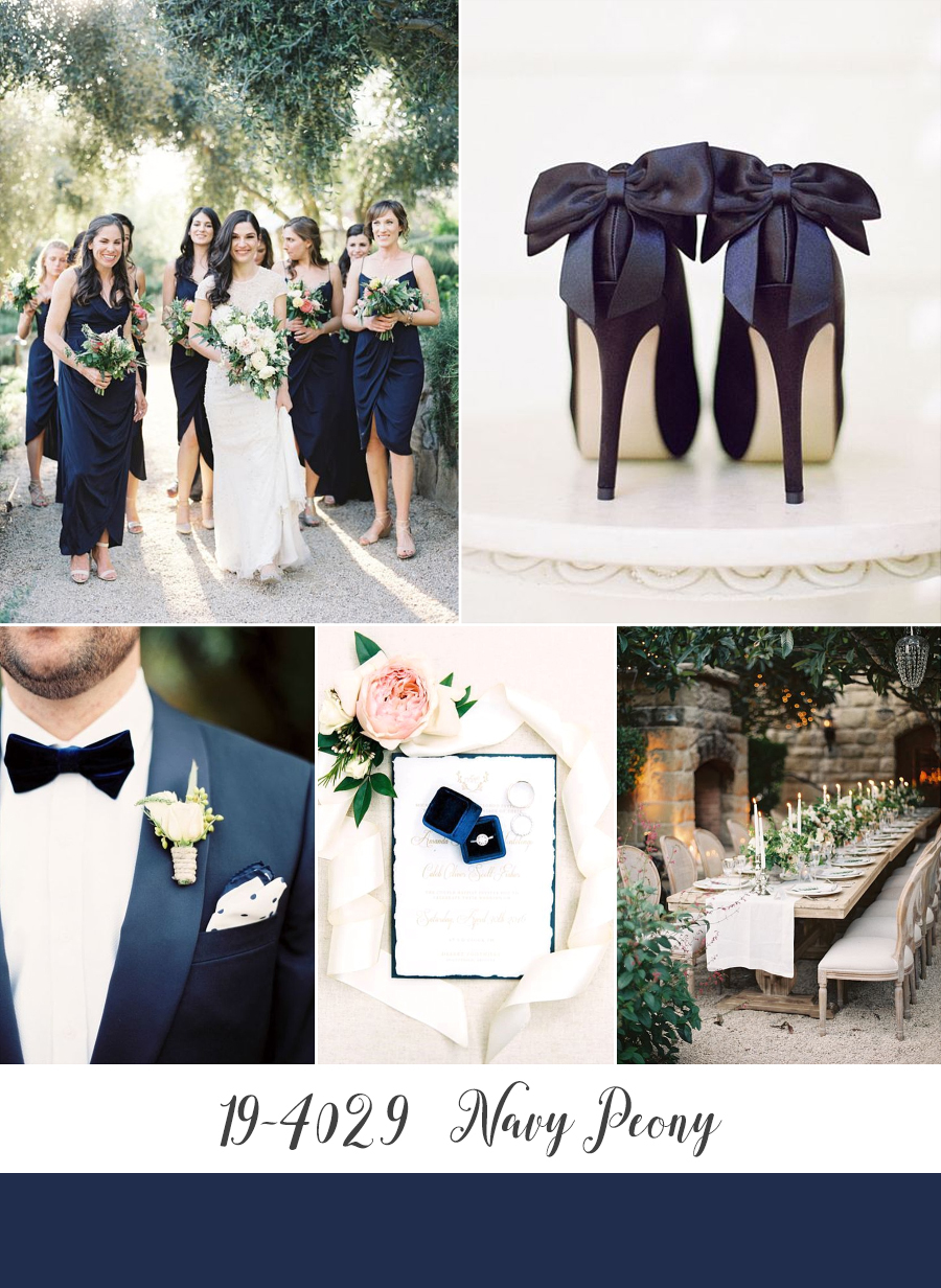
Bridesmaids – Jen Huang via SMP // Heels – Lacie Hansen // Groom – Brushfire Photography via Elizabeth Anne Designs // Engagement Ring – Rachel Solomon via SMP // Garden Wedding Tablescape – Kurt Boomer via SMP
Well, that’s the end of Part I, Part II which comprises of Pantone’s more unusual color choices for Fall is coming soon. But in the meantime be sure to let me know what you think of these rich Autumnal shades – do you have a fave? I would love to hear because as always I will be choosing one to become CVB’s next inspiration board, and at the moment I am completely torn! I love the jewel tones, but Golden Lime would make an exciting change…..
If you want to see how these compare to Pantone’s picks last Autumn, take a peek here and here. Or you might like these 10 stunning Fall wedding colour palettes. Or for more colour palette ideas, just have a look in the Inspiration Board archives here at Chic Vintage Brides – this rustic barn beauty was a favourite of mine and yours!
Amy
x

