Inspiration Boards
Top 10 Spring Wedding Colours for 2017 from Pantone – Part I
I look forward to the latest pretty shades from Pantone, our favorite global authority on all things color, more and more each year! This is in fact the third year I have been covering them here on Chic Vintage Brides (do take a peek at 2015 and 2016 if you missed them, they’re still just as lovely), and their top 10 for Spring 2017 did not disappoint!
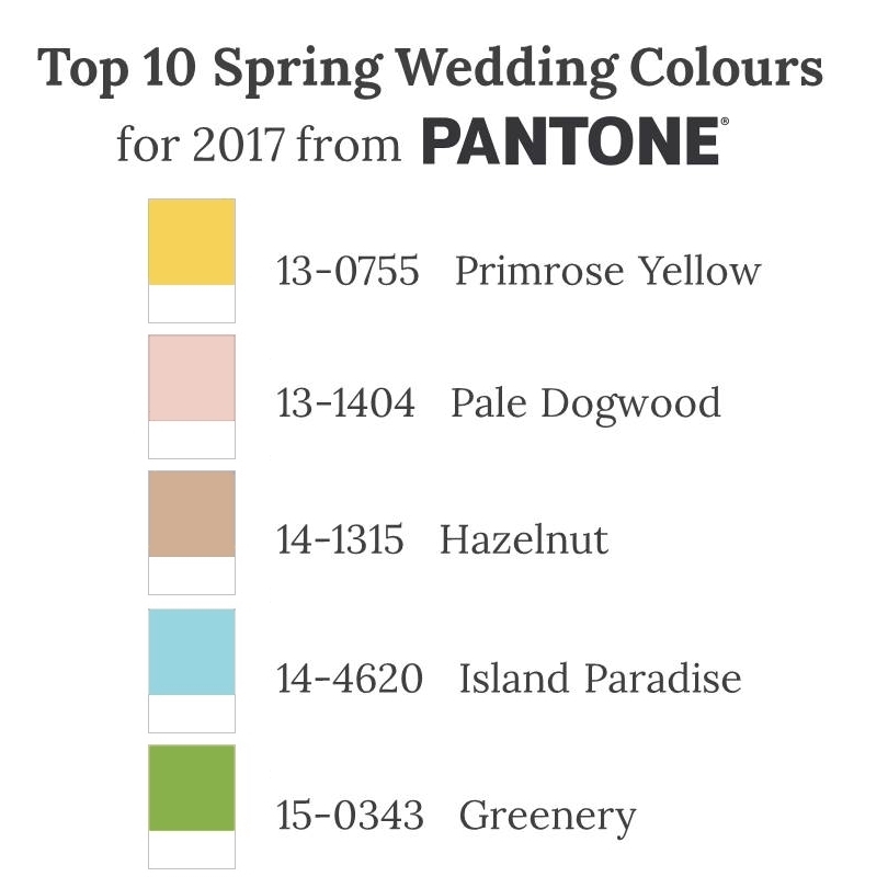
Of course, you might be sat there wondering “Who the heck is Pantone?” and, “Why do I care what colours they pick for next Spring?” Well, let me tell you! Pantone is the world authority on colour – their colour cards and codes are referenced and used by industries around the world, including fashion, home decor and wedding. So when they say a colour is going to be big next year, they’re usually bang on!
Have you noticed how this year has been awash with pretty pastel pinks and blues? That’s because Pantone named Serenity and Rose Quartz as their colours of the year. And did you wonder why last year everyone was loving deep, dark rusty reds? That would be because Marsala was Pantone’s colour of choice for 2015. Oh and what about radiant orchid? Who ever would have thought such a vibrant pink would take the wedding world by storm the way it did in 2014…. well, Pantone actually! They thought it, and they were right!
So you see, if you’re planning a wedding in 2017, you will want to know what colours Pantone has chosen, because these are the hues and shades that will be filling the stores, our wardrobes, our homes and of course Pinterest! Oh and if that’s not a good enough reason for you to take a peek, they are also super pretty….. like really, really lovely! A beautiful mix of vivid shades and more muted tones, all inspired by nature according to Leatrice Eiseman, Executive Director of the Pantone Color Institute.
“Reminiscent of the hues that surround us in nature, our Spring 2017 Fashion Color Report evokes a spectrum of emotion and feeling. From the warmth of sunny days with PANTONE 13-0755 Primrose Yellow to the invigorating feeling of breathing fresh mountain air with PANTONE 18-0107 Kale and the desire to escape to pristine waters with PANTONE 14-4620 Island Paradise, designers applied color in playful, yet thoughtful and precise combinations to fully capture the promises, hope and transformation that we yearn for each Spring.”
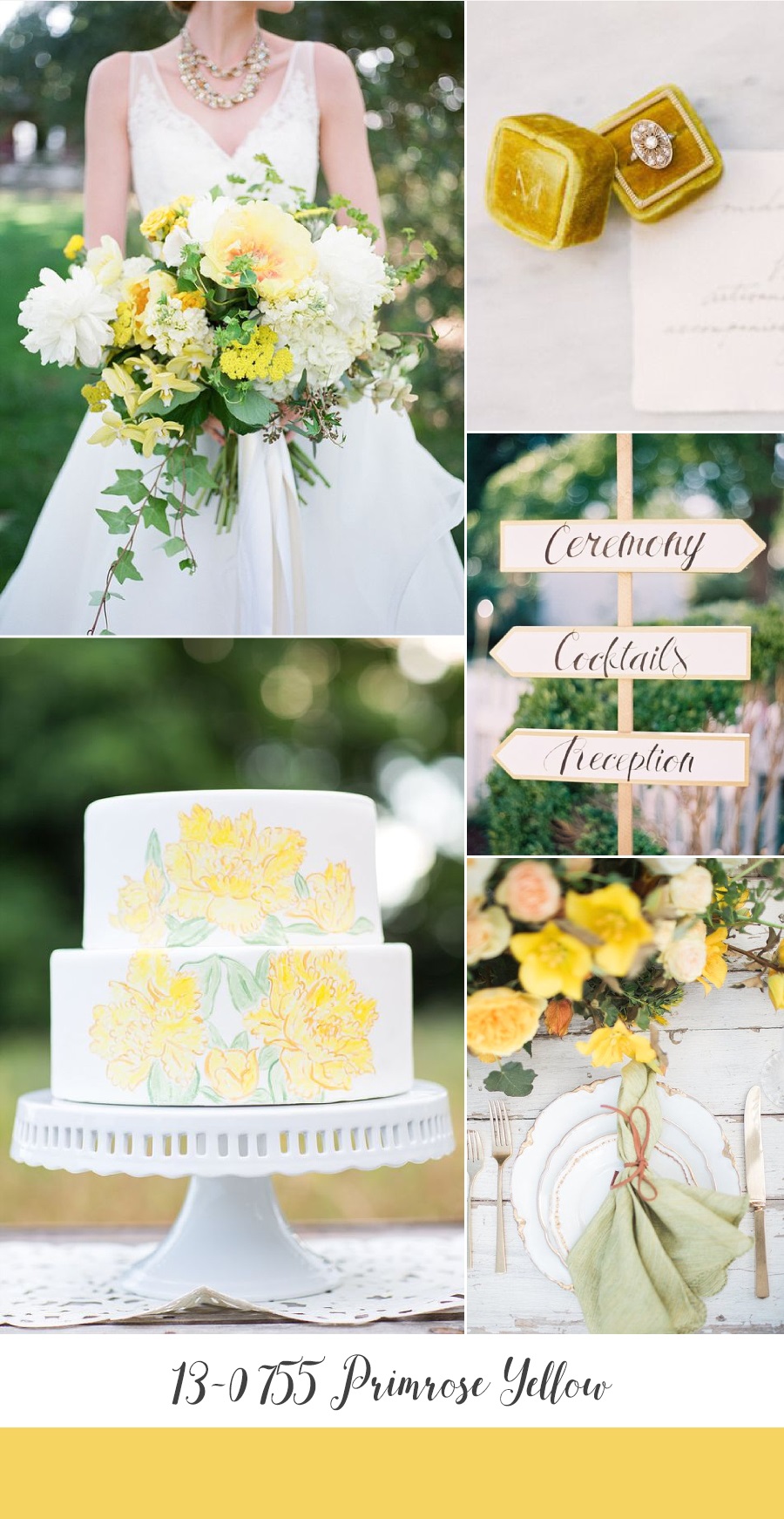
Primrose Yellow
Joyful Primrose Yellow epitomises Spring with its vibrancy and warmth, evoking those first sunshine filled days after Winter. It has a hint of age, with a beautifully muted elegance and would be the perfect pop for a garden wedding…..
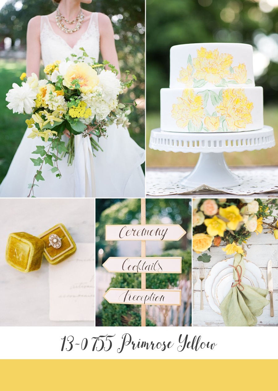
Bridal Bouquet ~ Anna Lepley Taylor, Photography by Diana McGregor via Grey Likes Weddings // Wedding Cake ~ Just Crumbs Cakes, Photography by Erin Lindsey Images // Engagement Ring ~ Trumpet and Horn, Photography by Carrie King via Wedding Sparrow // Wedding Sign ~ Laura Gordon Photography via SMP // Place Setting ~ Brooke Borough Photography via The Perfect Palette
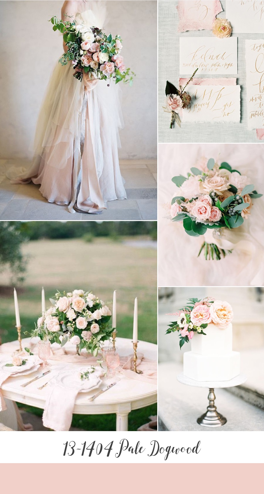
Pale Dogwood
A move on from Rose Quartz, Pale Dogwood is a subtle, delicate shade of pink that exudes romance as well as an aura of innocence and purity. It’s soft touch would be heavenly for an elegant modern-vintage wedding…..
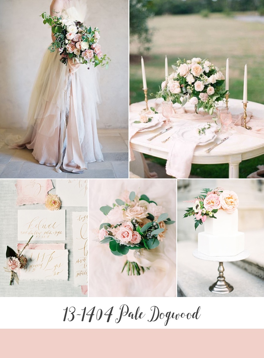
Bride & Bouquet ~ Honey of a Thousand Flowers, Photography by Jose Villa Photography via SMP // Wedding Tablescape ~ Qlix Photography via Polka Dot Bride on Aisle Society // Wedding Stationery ~ Graceline, Photography by Maria Lamb Photography via 100 Layer Cake // Bouquet ~ Flower Artistry, Photography by Justine Milton Photography via SMP // Wedding Cake ~ Layered Bake Shop, Photography by Kayla Barker Fine Art Photography via SMP
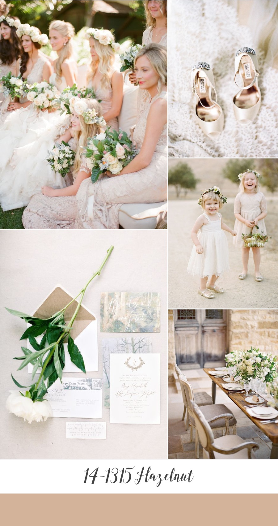
Hazelnut
A romantic neutral, with a hint of blush, Hazelnut is a key neutral for spring according to Pantone. More importantly though it is warm, timeless, sophisticated and simply perfect for a rustic vintage wedding…..
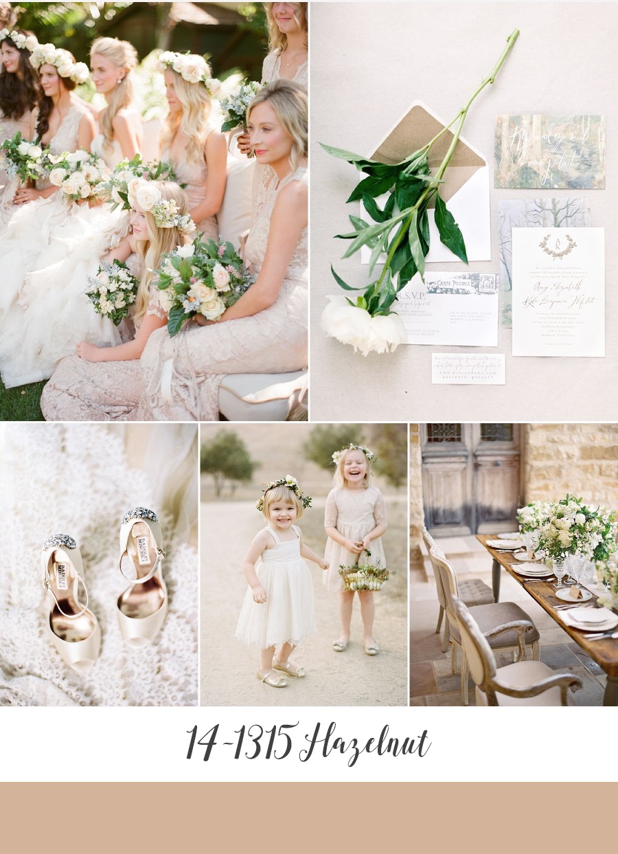
Bride & Bridesmaids ~ Megan Sorel Photography via Wedding Sparrow // Wedding Stationery Suite ~ Bungalow, Photography by Brumley & Wells via Once Wed // Bridal Shoes ~ Badgley Mischka via Marissa Lambert Photography // Flower Girls ~ Josh Gruetzmacher via Once Wed // Wedding Reception ~ Jose Villa Photography via SMP
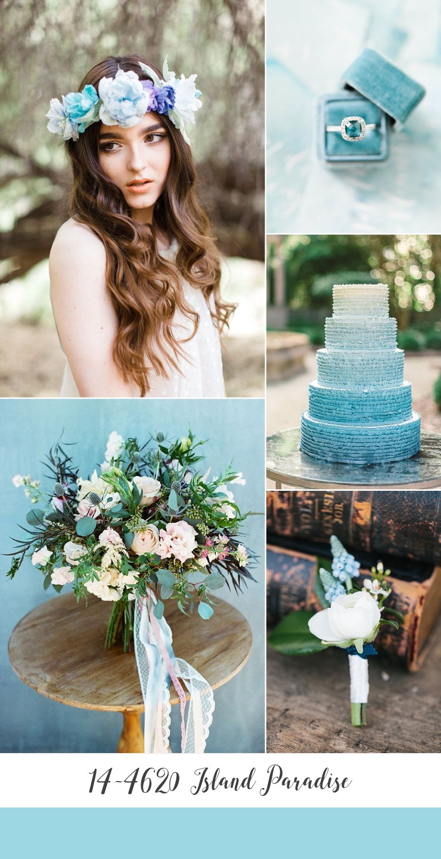
Island Paradise
Island Paradise is a refreshing shade of blue with a hint of aqua. Whilst the name may evoke tropical settings, I wanted to prove this is a versatile shade that would suit a budding woodland as well as a coastal backdrop…..
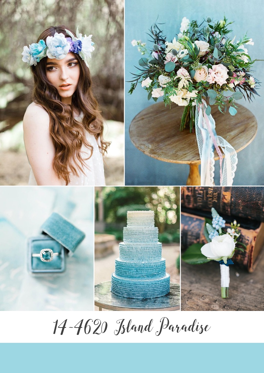
Bride ~ Rachel Solomon via Chic Vintage Brides // Bouquet ~ Peony + Plum, Photography by This Modern Romance via Green Wedding Shoes // Engagement Ring ~ Rachel May Photography via Weddings Unveiled // Wedding Cake ~ Rustic White Photography // Boutonniere ~ Botanique, Photography by Lora Grady Photography via Ruffled
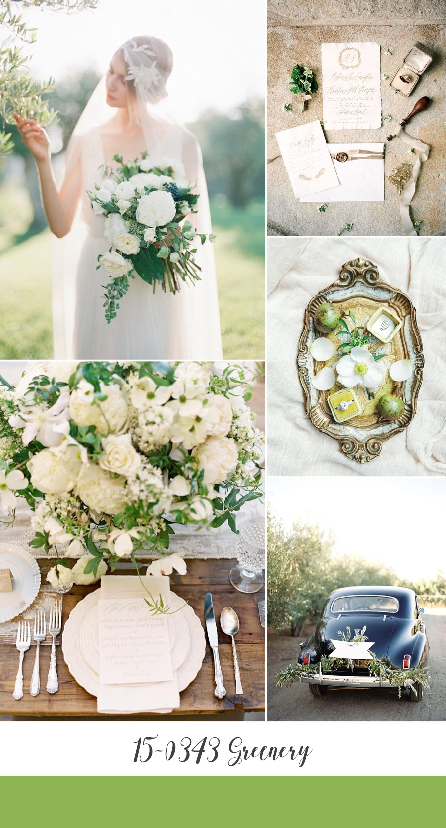
Greenery
My favourite of these first five shades, and a nod to the greenery trend we have seen in the wedding indsutry over the last 12 months or so, Greenery is a refreshing hue. Pair it with white to create an understated and chic celebration, or with its tangy twist it would look fabulously retro beside a bright shade of orange or blue….or both!
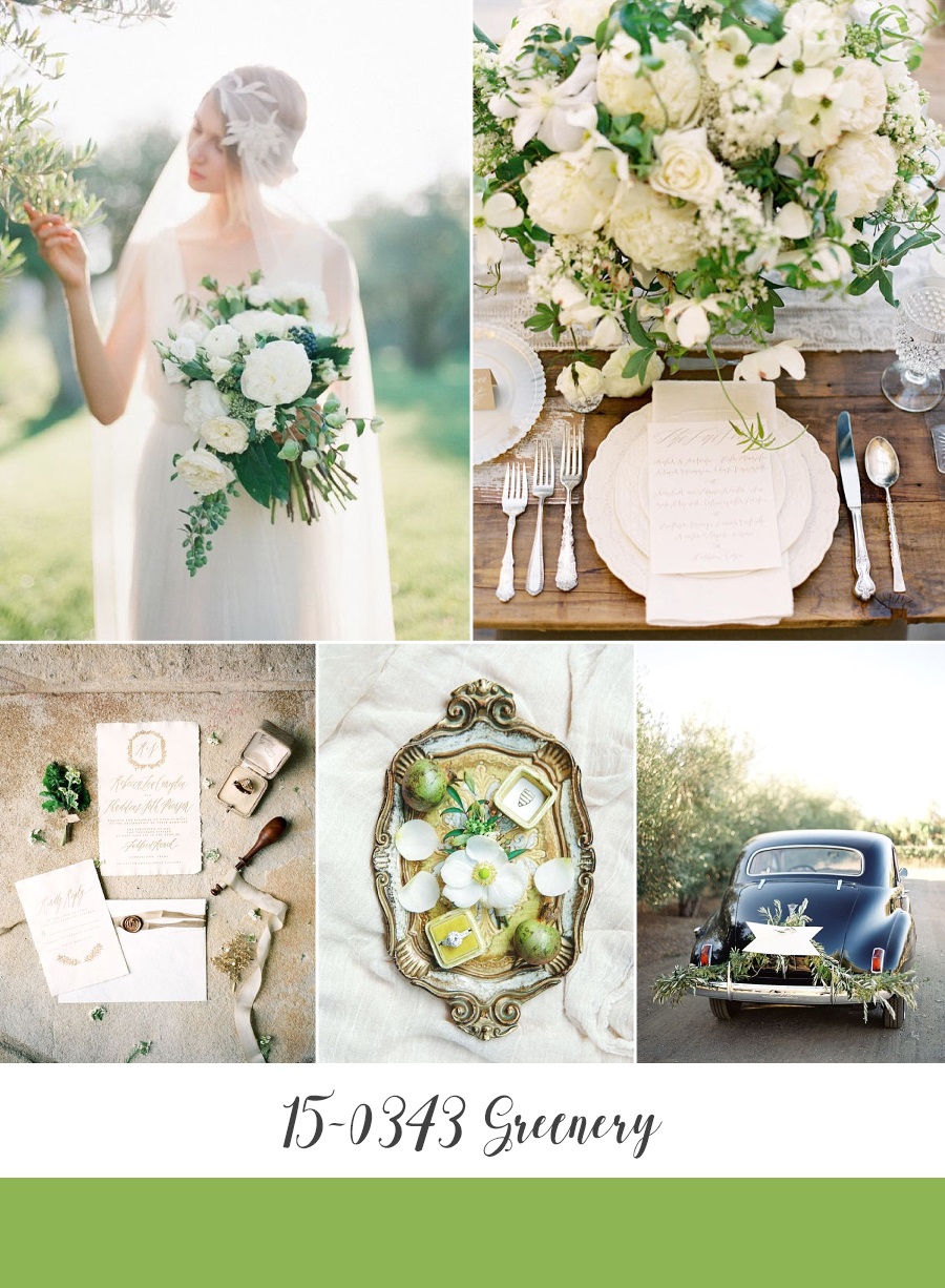
Bride ~ Artiese Studios // Place Setting ~ Jose Villa Photography via SMP // Wedding Stationery ~ Written Word Calligraphy, Photography by We Are Origami Photography via The Wedding Playbook // Engagement Ring Flat Lay ~ Mark Andrew Studio via Magnolia Rouge // Vintage Wedding Car ~ Jose Villa Photography via SMP
Well, that’s the end of Part I, Part II Pantone’s more muted selection for Spring is coming soon (I just LOVE Niagara and can’t wait for you to see it) So what do you think of these bright and beautiful shades? Do you have a favourite? I can’t help wondering where Pantone are going to turn for their colour of the year this year! Last year they surprised us by choosing two (Serenity & Rose Quartz) how are they going to top that this year??
Amy
x

