Inspiration Boards
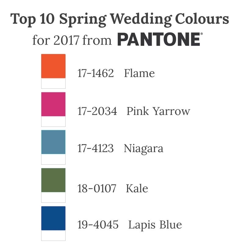
Top 10 Spring Wedding Colours for 2017 from Pantone – Part II
I’m sure you can’t have forgotten those pretty pastels from Pantone’s Top 10 Colours for Spring 2017 (you can see them here if you missed them and the inside scoop on who Pantone are and why you should care what colours they pick) Well, today I’m sharing Part II, a mix of bold tropical brights and understated dusky shades that couldn’t be more different! And whilst some may leave you wondering, others are quite simply breathtaking…..
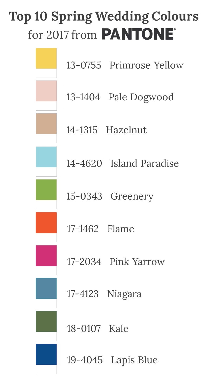
In recent years Pantone has shown a whim for throwing some unconventional shades into their Top 10 mix – like Bodacious in Fall and Fiesta in Spring? So it came as no surprise to see some unusual and even offbeat colours for Spring 2017, but they still left me needing some convincing. After taking a closer look though, and pulling together these inspiration boards to show how they could be interpreted and infused into a wedding, those colours that I was most unsure about, turned out to be some of my favourites!…..
Flame
A red-based orange, Flame 17-1462 might be a shade more naturally associated with Fall, making it a somewhat surprising choice for a Spring or Summer celebration. However, wonderfully flamboyant and vivacious, it will be sure to add fun and a hint of retro charm to any wedding…..
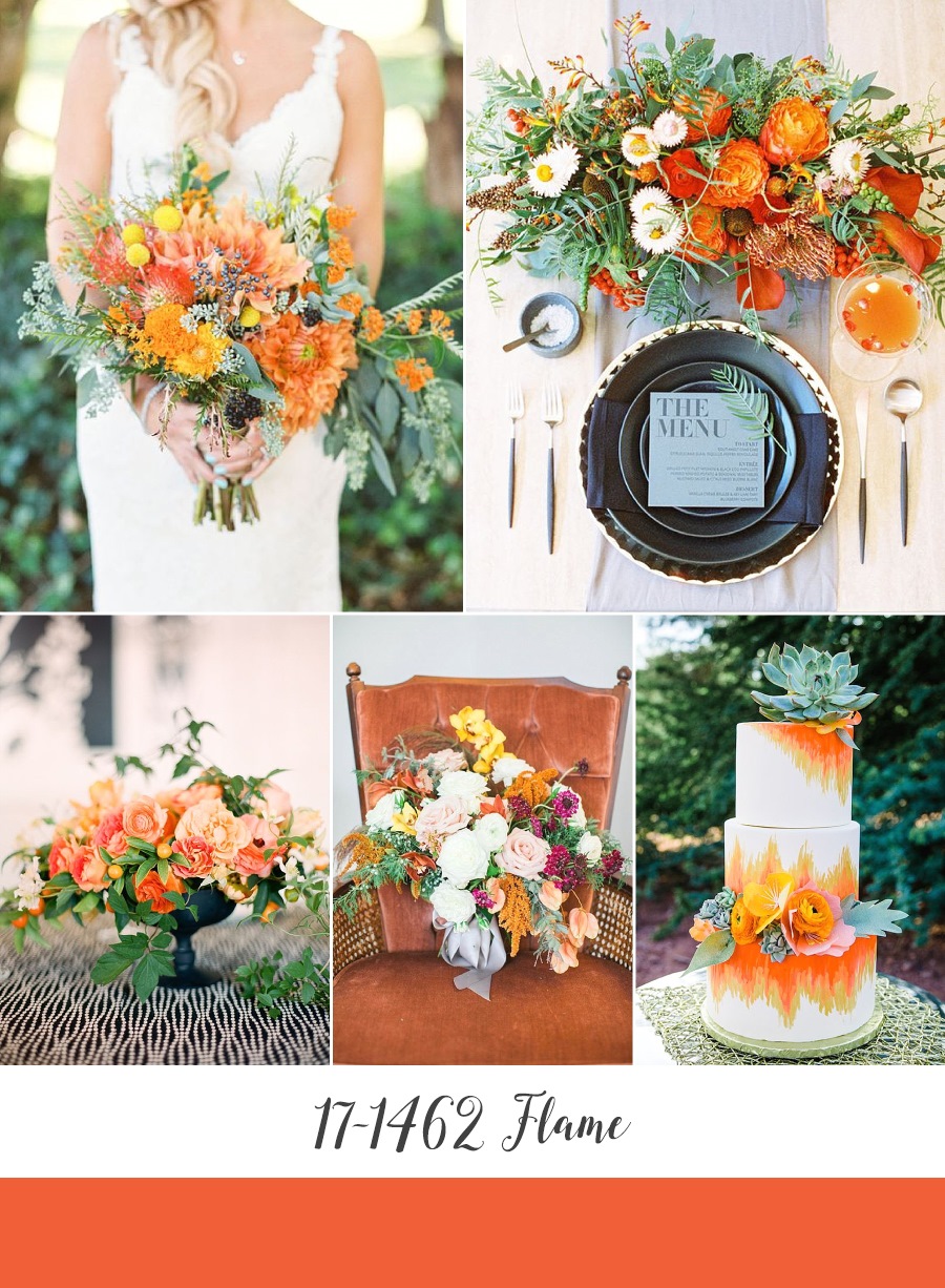
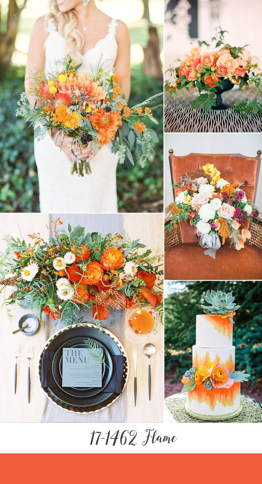
Bouquet ~ Belovely Floral and Event Design, Photography by Lauren Fair Photography via Green Wedding Shoes // Place Setting ~ via Hey Wedding Lady // Centerpiece ~ Max Gill, Photography by Lisa Lefkowitz via Snippet & Ink // Bouquet & Velvet Chair ~ Statice, Photography by Victoria Elizabeth Photography via Aisle Society, originally published on A Coastal Bride // Wedding Cake ~ Caketini, Photography by Rachael Koscica Photography via The Perfect Palette
Pink Yarrow
I’ve never been a pink kind of girl, but with a tropical vibrancy Pantone’s Pink Yarrow 17-2034 is a captivating and lively pink that is impossible to ignore! Brimming with romance it is the perfect shade for a floral-filled garden (or outdoor) affair. Mix with other shades of pink for a girly fantasy, or contrast with a rich navy for a more sophisticated palette…..
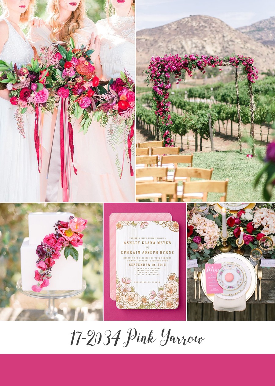
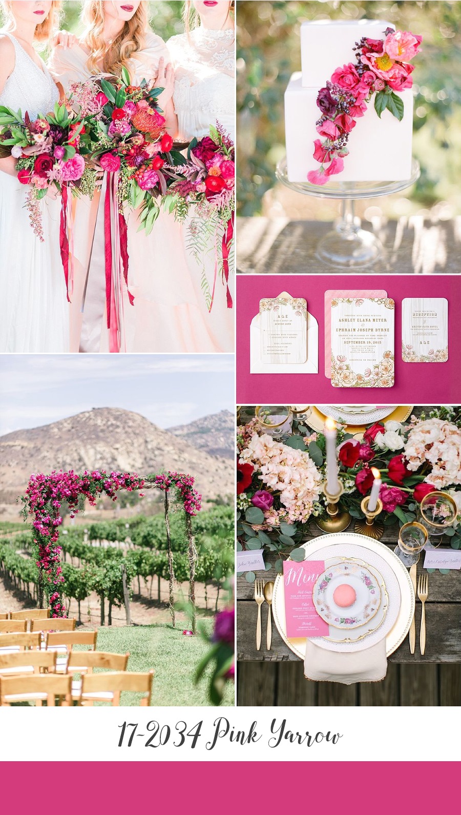
Bouquets ~ Holly Chapple Flowers, Photography by Mikaela Marie Photography via Glamour & Grace // Ceremony Floral Arch ~ Isari Flower Studio + Event Design, Photography by We Heart Photography via SMP// Wedding Cake ~ M Cakes Sweets, Photography by KT Merry via Flutter Mag // Stationery ~ Wedding Paper Divas // Place Setting ~ Ashley Tingley via Le Magnifique Blog
Niagara
One of my absolute favourites, Niagara 17-4123 is a move on from last year’s Serenity. A more sophisticated, darker and duskier shade it has an air of dreamy romance and will look gorgeous for Spring or Summer. Thanks to its hint of grey it also have a beautifully aged feel, that makes it perfect for a vintage or modern-vintage wedding….
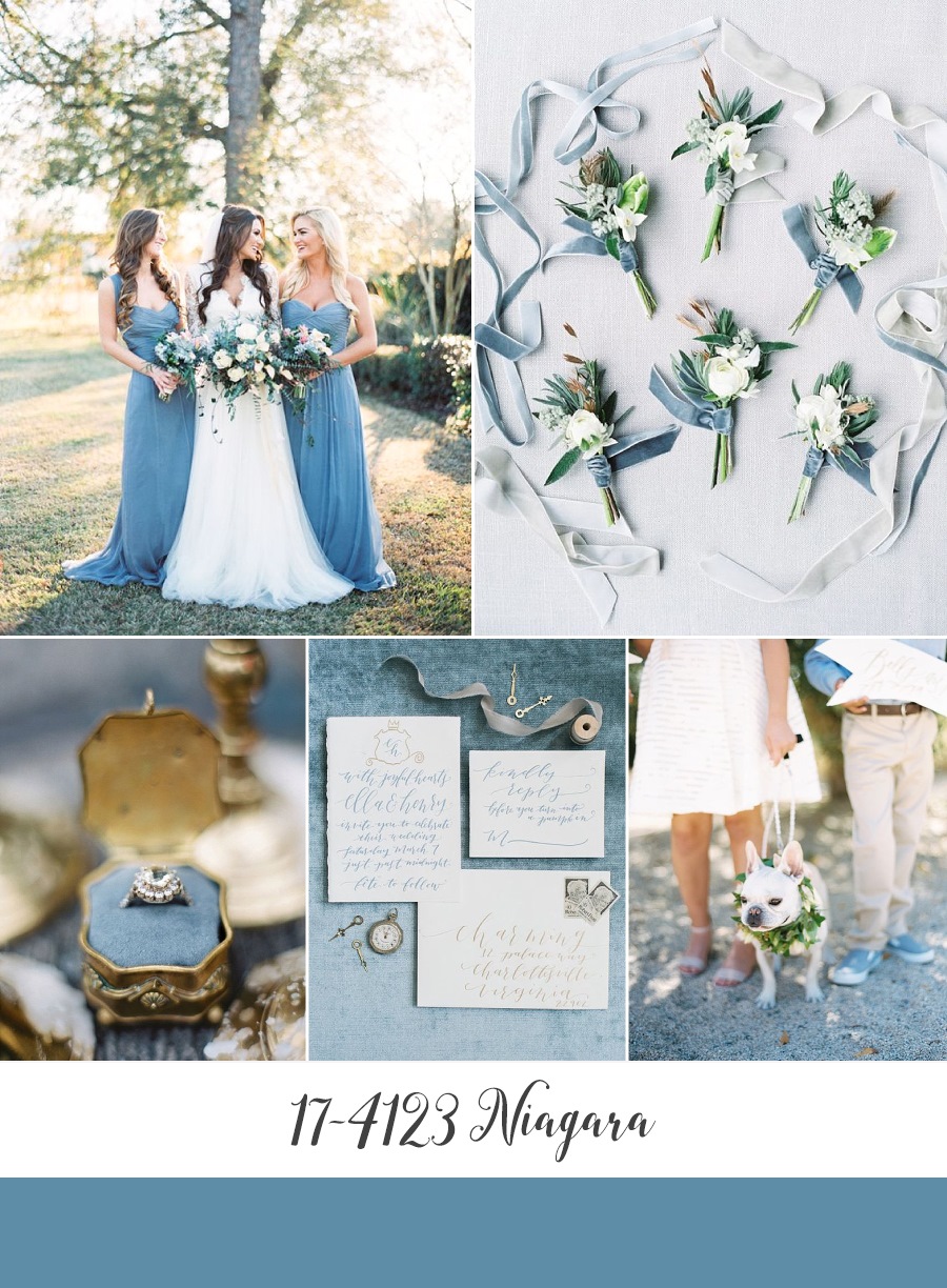
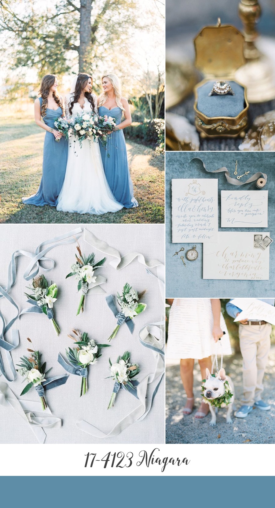
Bride & Bridesmaids ~ Jacqueline Dallimore via Wedding Sparrow // Boutonnieres ~ Vervain, Photography by Sarah Hannam via BLoved Blog // Engagement Ring ~ Blaine Siesser Photography via SMP // Wedding Stationery ~ Poppy and Scooter, Photography by Rachel May Photography via Elizabeth Anne Designs // Ring Bearer, Flower Girl & Dog ~ Kurt Boomer via SMP
Kale
Of all of Pantone’s Top 10, this is the shade I liked least upon first look. But with an olde world elegance, thanks to a hint of grey, and its natural beauty it soon won me over! Chic on its own, it’s also the perfect complementary shade for more romantic or vibrant tones – I see it looking a picture with Blush!
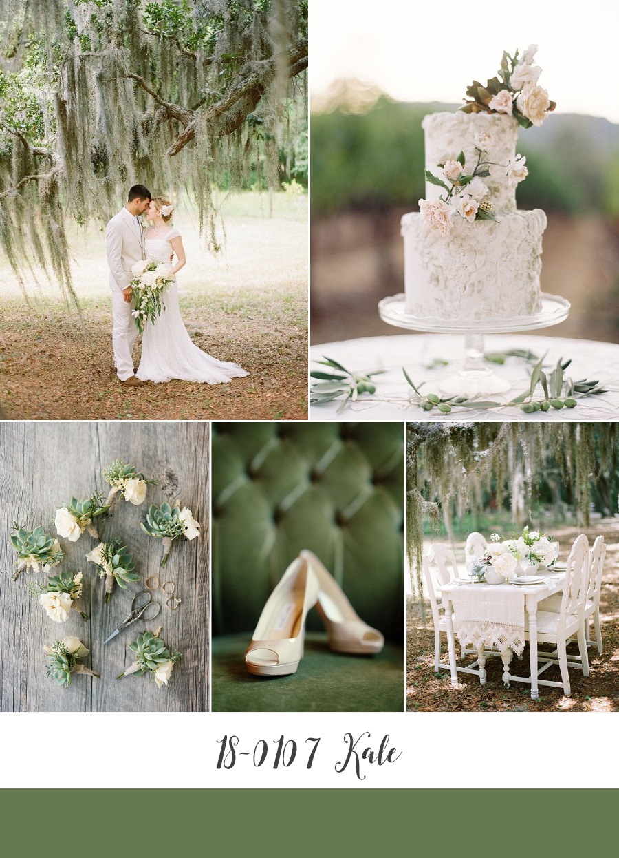
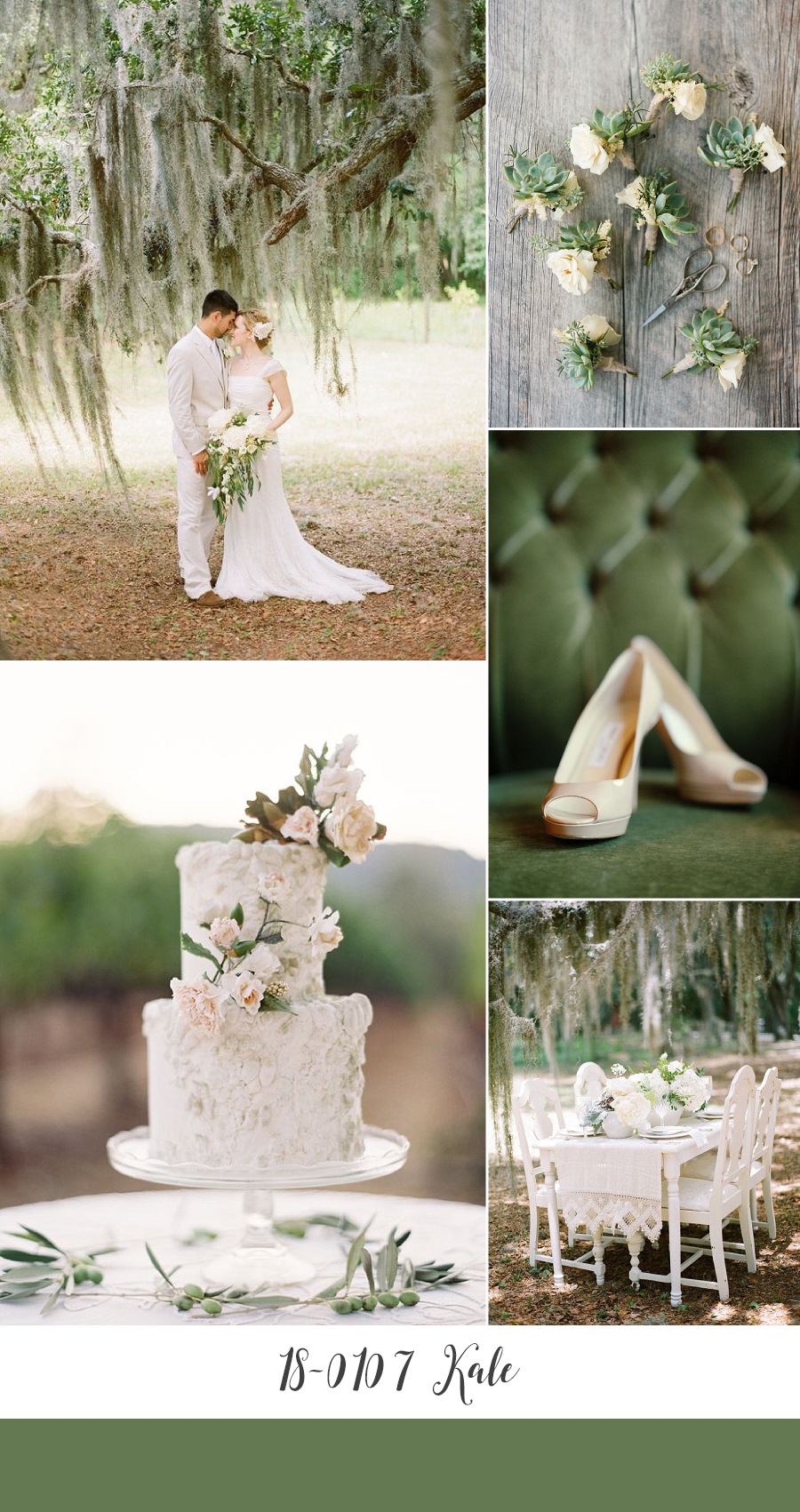
Bride & Groom ~ Austin Warnock Photography via SMP // Wedding Cake ~ Maggie Austin via Jose Villa // Boutonnieres ~ Clayton Austin // Bridal Shoes ~ Jimmy Choo, Photography by Robert & Kathleen via SMP // Tablescape ~ Austin Warnock Photography via SMP
Lapis Blue
An intense shade, Lapis Blue 19-4045 is the Spring Summer take on rich jewel tones. A colour that evokes radiance and opulence it creates quite the palette when added to a rich Summery red (and would look just as lovely with coral), and is sure to be loved as much by your groom and his groomsmen as by you!…..
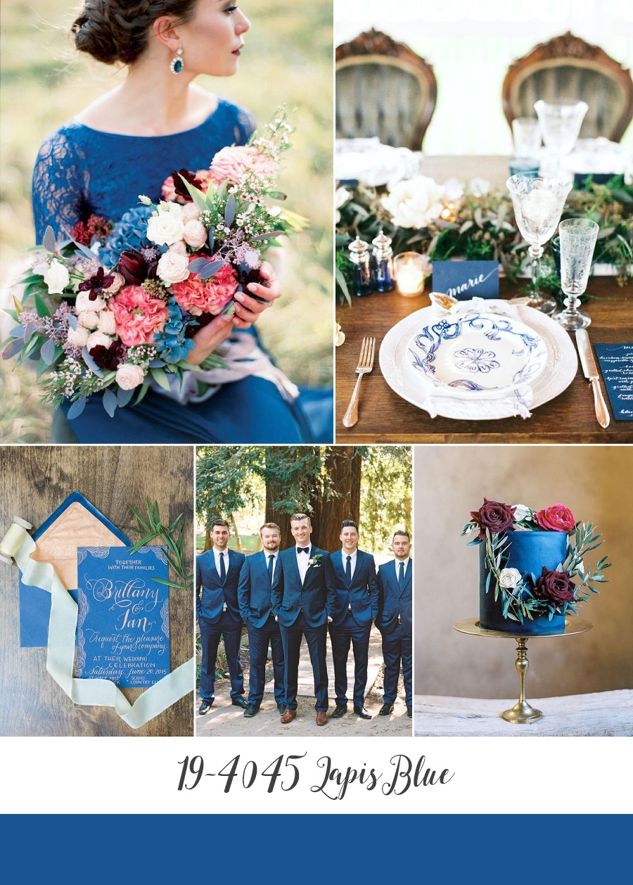
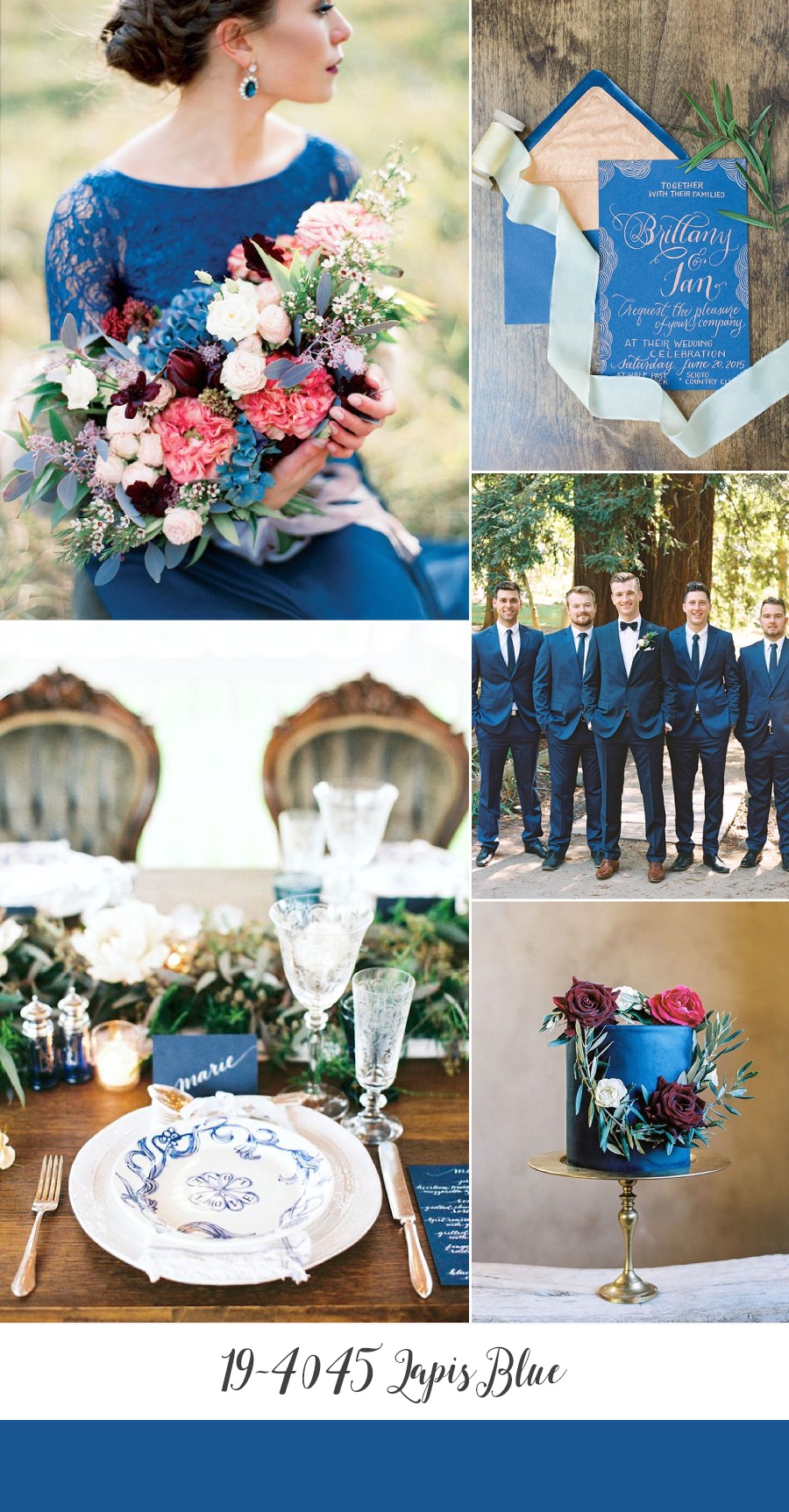
Bride & Bouquet ~ Voulezvous, Photography by Ksenia Milushkina via Burnetts Boards // Place Setting ~ Stephanie Yonce Photography via Burnetts Boards // Stationery ~ Myrtle & Lloyd, Photography by Olivia Richards Photography via Ruffled // Groom & Groomsmen ~ Mariel Hannah via SMP // Wedding Cake ~ A Bake Shop, Photography by Rachel Solomon Photography via Hey Wedding Lady
Right, so now you’ve seen all of Pantone’s picks for Spring 2017, what do you think? Lovelier than last year’s?? Be sure to let me know, along with your favourite for a Spring or Summer celebration and it might just be in the colour palette for CVBs next inspiration board.
Whilst 2016 has truly flown by (can you believe it’s December already??), what with these and the fabulous wedding dress collections we have glimpsed, I cannot wait to start seeing next year’s weddings! I am quite envious of all of you getting married in 2017.
Amy
x


